Supporting Dyslexic Readers
Dyslexia is a learning difference that can affect the ability to read, write and spell. Speech, maths, motor and organisational skills may also be affected.
Dyslexia used to be regarded as a 'disability', but our understanding has come on since those days. People with dyslexia are no less (or more) intelligent than their peers, but they often have different strengths and weaknesses and as a result need different support to realise their full potential. For example, there is some evidence that people with dyslexia are better visual thinkers than non-dyslexics.
There are a few things that can be done in designing books that help dyslexic readers:
- Avoid the glare of white paper. Books printed on white paper can cause visual stress in dyslexic readers, making the words on the page seem to jump or dance. Reducing visual stress can be done either by printing the books on off-white paper or by using full-size images and photos that cover the entire page. In both cases glare is reduced. (Some teachers report that using coloured (clear plastic) overlays can help, but this only works with some children - and the best colour to use tends to vary.)
- Careful choice of font can help prevent people with dyslexia confusing letter shapes.
- Texts that are left-aligned (rather than fully justified) are easier to read, as the spacing of letters and words remains consistent throughout.
- Clear spacing between lines of text can help minimise confusion, blurring and switching.
- Clear separation between text and other things on the page (images, photographs, etc.) again can help minimise confusion and visual stress.
- Thick paper helps to ensure words and pictures don’t show through from other pages and confuse the eye.
- And of course all texts should be carefully written and edited to ensure that the texts themselves are accessible and age-appropriate.
If you suspect that your child might be dyslexic, we recommend that you contact your school in the first instance. you should be able to request a dyslexia screening, which is the first step in identifying whether there is a problem.
You can find out more about dyslexia on the British Dyslexia Association website.
Ransom's dyslexia-friendly titles
Ransom specialises in supporting struggling readers of all types, and whilst some of our series are not so suitable for dyslexic readers, most of our series were designed with dyslexic readers in mind. In fact we offer some of the best dyslexia-friendly titles available. The following is just a shortlist of suitable titles, with links to find them on the website.

Boffin Boy (18 books)
Comic-format, full-colour stories with speech bubbles. Usually only one picture per page (avoiding the confusion of traditional comics). Speech bubbles throughout, each featuring text on a yellow (not white) background. The font used is suitable for dyslexic readers (definitely not comic-format capitals!). Good borders around speech bubbles, clearly separating text from image. No white space in the books.

321 Go (9 books)
Full-colour non-fiction recount-format books, narrated by an individual using speech-bubble format. Usually only one photo per page. Speech bubbles throughout, each featuring text on a yellow (not white) background. Font used is suitable for dyslexic readers (definitely not comic-format capitals!). Good borders around speech bubbles, clearly separating text from image. No white space in the books.

Goal (42 books)
A set of phonics-based readers (fiction & non-fiction), all on football-related topics. Full colour throught, with no white space anywhere. All text is on a solid colour background (red, green, black, etc.) reducing glare. Clear separation between text and image. Dyslexia-friendly font used throughout. Some books include speech bubbles - in which case the text is on a coloured background. Left justified (not fully justified) text, giving regular spacing between letters/words.

Feely (6 books) Pig (18 books)
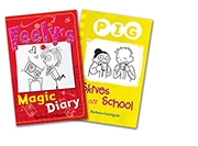
Two reading series in the ‘Wimpy Kid’ handwritten diary format. Much simpler and shorter than Wimpy Kid, making them suitable for readers who struggle. Despite using ‘handwritten' font, the books include horizontal lines under each line (not unlike a lined notepad), making tracking easier. Left justified (not fully justified) text, giving regular spacing between letters/words. Printed on off-white paper. Illustrated throughout. Oh - and very funny!

Steve Sharp (6 books)
Very simple, low-level texts. b/w illustrations. Text is reversed out so text is white on black pages. This reduces the glare of white paper. Careful choice of font. Very clear separation between images and text. All printed on matt art paper - very high quality, unusual for black and white books. Left justified (not fully justified) text, giving regular spacing between letters/words.

Dark Man (30 books)
Age-appropriate font, very clear, good for dyslexic readers. Printed on off-white paper. Very clear separation between text and image. Left justified (not fully justified) text, giving regular spacing between letters/words.

Promises (10 books) Toxic (10 books) Siti's Sisters (24 books)
Low-level readers ranging from very short, simple texts to slightly longer chapter books. Some books are illustrated. Clear separation between text and image. Left justified (not fully justified) text, giving regular spacing between letters/words.

Shades (76 books)
Longer-form (6,000 word) chapter books. Carefully chosen font (more ‘grown-up, serifed font but with single storey ‘a’ nd ‘g’ letters. Slightly larger than usual font and good line spacing. Left justified (not fully justified) text, giving regular spacing between letters/words. Some of the titles (‘Sharp Shades’) are half the length, with larger margins and line spacing and some illustrations. All printed on off-white paper.


